Tuesday 10 December 2013

Two Pastel Paintings, Mace Reeds and The River

I have completed two pastel painting this week, both were paintings which I was not sure of and left them to mature before adding final touches.

The first was from a photograph which had been posted by a friend who graciously gave permission for me to use as a reference for the piece. It is basically a photo of a mace reed bed and I was attracted to it because of the multitude of colours which became obvious as you looked at the photo. Very simple on the surface but became less so as you looked hard at it. Here is the painting:-


The range of greens and yellows/browns is actually impressive. The top border consists of reflections of dead and dying foliage at the edge of the pool. In fact I have tried to put some movement into the reeds by snaking the leaves rather than leaving them stiff and straight.

The second pastel is in fact taken from a watercolour painting I did when holidaying at a small village (three houses and a pub) called Cwym Cych, in North Wales close to Abersoch. The pastel is very high key (for me) and reflects the watercolour. The origjnal was a wet-into-wet piece with very few hard lines, so I was unsure whether it would translate into pastel, but here it is:-


If you look carefully at the piece you may see horizontal lines through the top of the LHS trees and across the sky. It appears that the paper was faulty as I have rubbed out the lines and when adding back the pastel the llines have reappeared. These things are sent to try us.

Tuesday 19 November 2013

Winter Sunset, a new pastel landscape

I was on holiday recently and saw some postcards by a local artist, Barbara Curry, I was struck by the brillliant colours in the sunset which as you know if you follow this blog is one of my favourite subjects. I simply had to try and re-create this painting which was originally in oils. My medium is of course pastel. I bought a couple of Barbara's cards and have just found the time to use it as an exercise. I was quite pleased with the overall effect but maybe I should have given a little more thought to the mid-distance village.


WINTER SUNSET (pastel, A4 size) after Barbara Curry

One of the problems for an artist is that they must always be comparisons with the original. If you have browsed across to the link provided, you will no doubt be aware that although I have taken the specific painting as a reference and tried to re-create it, it is not as good as the original for several reasons. But I leave that up to your own analysis.

Monday 11 November 2013

Presentation: Elements and Principles of Art, from Slideshare

I haven't managed to get much painting done recently so again the blog is suffering but I thought that this presentation from Slideshare was worth sharing.

Nothing new and to a regular artist not rocket science but it is neatly and effectively presented and serves as a great reminder.


I have not yet fully explored this site, all sorts of presentations and I may come back on this one if it seems to have any "artistic" uses or merit. The site may be used by guests to view the presentations (powerpoint style?) but to upload you do need to register, it appears to be free with possible upgrades which are likely to need subscription.

Wednesday 30 October 2013

65% Off Printed Canvasses - Two Days Only

Just received this notification from Zazzle and thought I would pass it on, if you have ever been tempted by by any of my paintings this could be your opportunity

Exclusive 2-Day Sale! 65% OFF All Wrapped Canvases  
USE CODE: CANVAS4WALLS

Check out my canvasses on my zazzle shop

I do have many other paintings on other stores which you can find easily from my profile page on Zazzle, using the above link as a first stop.

Even if you are not in the market for a stretched canvas print, there are many products (posters, cards, postcards, mugs, etc) which are all excellent quality. But you are allowed to just browse ...  
 

Thursday 24 October 2013

Painting a pastel landscape from a watercolour

I have been a little lazy recently in terms of my painting, and looking over some old watercolours decided to try one or two of them in pastel. Should be easy! However watercolour has features very different from pastel in many respects and the feeling of a watercolour could be difficult to achieve.

So I set myself this little challenge. Take a watercolour and repeat it in pastel to create a painting with the same feel.

This was the first painting I would try:-


This had always been a favourite of mine and I felt that for the puposes of this challenge it would be ideal. The earth colours gave it a very definite autumnal feel. Also, the light background spoke of mists and early morning.

The image I actually used as a reference for the pastel was actually cropped, I don't kbnow why, to remove some of the area from each side. But never mind, here is the pastel:-


Not quite as much detail, especially in the foreground, but nevertheless I am quite pleased with the outcome of this experiment. I am of a mind to do it again using the full sized original and concentrate more on the foreground but I will try one or two others before I do that.

I feel that the feeling of the original watercolour has been captured, success!


Tuesday 15 October 2013

New Pastel Landscape Painting

I have been so busy lately that I have found it difficult to find time to paint. Fresh back from holiday in the Canary islands, I attended my art group tonight and came away with another painting, hope that you like it.


My colleagues saw this and though it had been painted using a dark/black paper. However, it is done on a white ground. I do create a background using dark colours before I start painting. I do this by layering several colours which I choose based on the effect I hope to achieve.

This painting was started with a covering of purple pastel, this was loosely rubbed in and fixed to avoid mixing with subsequent layers. the next layer was a dark blue. A less intense covering this time, but again rubbed in using the tips of my fingers and well fixed. A final background layer od black was then layed down.

Someone said, "why not use black paper?". The answer is that I find black paper too flat, I prefer the dark colour obtained by building up two or three layers.

In this case the black layer was not fixed and I painted the foliage into a soft black layer. There was some mixing but I kept it to a minimum and constantly wiped the pastel sticks used for the foliage to avoid any over mixing.

The final steps were to draw in the grey tree trunks, and add a shadow to the nearer trees; and then to add some linear marks to represent reeds, etc, by the bank of the water.

Reflections were added very simply by drawing down with the same colours used on the top part of the painting.

Wednesday 21 August 2013

How many ways of painting the same scene.

Well of course there are an unmeasureable number of ways of painting essentially the same picture. Think of the haystacks or lillies of monet!

In my last post on this blog, I talked about a painter, Paul Bailey whose work I had come across on Facebook, I was inspired by some of his watercolours, and wanted to know if I could get the same sort of feel using soft pastels. The theme which particularly captured my attention was of trees on a hillside, sillouetted against a sky. Now, if you have been reading this blog, you will know I have used this theme a number of times previously but they were very different in their feel to those of this artist. For the last two weeks I have been experimenting at my weekly art group sessions to try and replicate the watercolours in artists' pastels.

I am not sure if I succeeded in my original aim but I am very pleased with the results and hope that you will enjoy them as well.


This painting was the first, I had given a little thought to the trees, mostly with respect to the colours I would use to obtain the sense of recession. But most of my attention was on how I would achieve the textures and intense colour which I wanted in the foreground.

I selected a palette of colours, I always tend to take the main colours out of my box and line them up ready for use. This saves scrabbling about searching for the next / right colour that I want to use and helps me to keep up a momentum once I start painting. No time to lose that inspiration!

I had decided that I would create a sloping hillside with a "valley" running through the centre and used a bright red colour (more than one in fact) to paint diagonal slopes to the nearest hillside. I used the sides of the pastel sticks with a light pressure to create a textured appearance on the black art paper. The further slopes were similarly painted with a less intense red and with the introduction of a purple colour, to give a feel of recession again. The dark blues used in the lower corners, I must admit, were a reflection of the reference painting that I was using and seemed to me to help contain the picture within the paper.

The sky was also very similar to the reference. A very light raw sienna along the hill tops gave the impression of a sunset (another favourite subject of mine). A light blue was used for the bulk of the sky with two (yes I know it should have been one or three) large massses to represent clouds.

I drew the trees still thinking about that recession I wanted to show, and did not realise until I had finished just how rigid and wooden (no pun intended) they were. I immediately started to think about the second painting in order to correct that, now, very obvious error -as I saw it.


Again I chose a palette of colours, in many ways very different to the previous choices.  But this time I was going to take a different approach to the hillside and I wanted to create an effect which could be called a sunrise. In the sky,I used a similar blue for an underpainting but used the light raw sienna to produce the effect of a glow from the lower centre of the sky.

The hillside was painted in black / dark browns which became my underpainting (BTW I call it this but it is just an initial layer which allows me to work on somethng other than white - or black in the case of this paper). I then lightly stroked in with reds and reddish browns and with shades of orange to create the feeling and appearance of rocks and undergrowth. In this painting, I must not have fixed the pastel marks properly, before completing the painting. It looks as if the LHS has become smudged. I gues I really should step away from my work now and then whilst it is in progress. I do get carried away!

But on the whole, I am quite satisfied with both paintings and think that I have learnt some valuable lessons.

I will include the next two in the series without actually saying much about them. In the next, I used many more colours in the foreground otherwise, I used lessons learnt from the first two paintings.


And for the last, a very quick (20 minutes before having to start clearing up) version of a simmilar scene with shadows on snow.


Although It looks simple, I did wowrk very quickly and the sky was actually painted in several layers. The snow needed to be toned down from the white of the paper and I chose a very light green-blue, you can juat see the texture in the on-screen image.

Because I did use several layers for the sky and found time to take a couple of photographs, I will be discussing my technique further in the next post - see you then?

Monday 12 August 2013

Paul Bailey - Artist

I have been following this great artist on Facebook for a little while, painting in watercolour and acrylic he creates some wonderful art work. His facebook page also links to his own website and an Etsy shop.

this is a selection of paintings on sale in his Etsy shop:-


I love the free brushwork in his acrylics and the use of wet-into-wet techniques in his watercolours. I would have to select the watercolours as my favourites. Many of my favourites have a semi-abstract approach which as you will know if you follow my blog, is very much where I am coming from in my own paintings. If you are interested by this small selection, take a look at the etsy shop. The paintings are also very economically priced and worth consideration byh any potential collectors or just for that spot on the wall that you stare at all night.

Wednesday 7 August 2013

Red Sky at Night, a pastel painting

My latest creation was completed last night at my regular art group meeting, I have to admit is was from an idea in an art magazine advert. I usually make far more changes to my work when I use another piece as a reference but most old masters have copied works by other old masters since time immemorial, and in a spirit of learning, I have painted my own version of this image.

The colours were the main atttraction for me, but the variation in the tints and shades within the large flat areas was something that is new to me. I know all about variation as a principle of composition but I mostly use texture to provide it. Here it is a use of a those differing colours that I have trie to understand and copy.

Here is a version of the painting as a work in progress:-


It is very nearly completed but lacks details. Also, I took the photo late at night in a room lit by ordinary light and did not use flash, so the colours are "wrong". A problem with not using the right light, photographers and artists will be familiar with this problem.

The completed work is show below:-


Having taken a photo in better light, the colours are much truer to the original, but still long way out. I am going to havae to take another in bright daylight before I start posting to places like Zazzle. I will also post the newer image here for comparison.
Note the additional details including the beansticks (support for climbing vegetables found in many UK gardens). More contrast in the sky and trees.

Watch out for the improved photograph soon.


Tuesday 30 July 2013

More Fun With Abstract Art

It has been a while since my last post, I have been enjoying the environment at Bubblews.

It is an income sharing site which allows posts on any subject (with the usual limitations to keep it family friendly) and will accept anything from 400 characters to full length articles. If you are used to submiting articles to this sort of site, you will miss the formatting which you are probably used to but a new version is promised on this new site over August. It is growing fast, not least because it shares 50% of advertising revenue with the writers (aka bubblers). It is a cross between a social media site (and interaction on the site is also paid) and an article writing site, which explains the wide variety in posts accepted. Check out a few of mine from my Bubblews profile page, I write more than many bubblers but many are beginning to understand about the concept of getting views from google and a passive income. Not conducive to internet marketing!

I am currently making $50 per month, although the potential is for much more. The only question is how much time you want to spend making money. It is probably the site with the fastest rate of potential earnings that I have seen. On many of the sites paying for views, monthly rates are less than an order of magnitude smaller than this.

But to the main reason for this post - I am back!

I will be posting on this blog again. I have had fun on Bubblews but do want that little extra freedon of writing on my own (?) blog.

So just a short post to kick-off with. Did you read my last post? I had several of my artist colleagues at an art-group meeting, make a few random marks and then I created an abstract painting by following the rules of composition. To create a vibrant and colourful image I used primary colours and the main feeling is one of activity due to the diagonal leaning of the red elements in the painting.


This is available as a gallery wrapped canvas print on my Zazzle Store.


( Back with more paintings soon)

Wednesday 27 March 2013

Fun With Abstract Paintings

Here is a great fun game for kids of all ages.


It also has a very beneficial training aspect for all artists, who would like to loosen up their paintings. Not everybody likes painting so-called loose paintings but since The early 1800's and the maturing of artists like Turner and then the impressionists, modern art and indeed abstract art has been developing.

Many leisure painters find that this is very difficult. The difficulty arises because these painters need to identify with the images they are copying. I am drawing a horse, a tree , a flower, etc. They cannot let go and just paint for the sake of it. I would like to offer an exercise which is great fun and very useful to aid with the process of loosening-up.

Because many art schools try to teach this under the banner of creativity and originality, at the expense of drawing skills and it has created a generation of artists who do not fully understand or possess the academic skills of their predecessors. But that it is another, very big question. I do not intend to address that here.

For now, assume that it is a good thing for an artist to be able to let themself go when painting, if even just for relaxing and fun. This is a way of allowing yourself to be free of constraints when painting, almost!
  
CREATING AN ABSTRACT FROM RANDOM MARKS


 I came across this technique in a book by Betsy Dillard Stroud called The Artist's Muse, ISBN 978-1-58180-875-9 and tried it out with my art group last night. This is the result.

I asked my colleagues (there were 11 of us present) to make some random marks on a sheet of paper, offering a choice of coloured pastel pencils and suggesting they could draw lines, shapes or squiggles, but giving no further instructions. I did tell them I was going to create an abstract based on their collective marks. At first some of them were a little tentative and I could see the beginning of a landscape, for instance the first person drew an horizon. I then offered them a second opportunity, which was taken by some of the early contributors as they could now see what everybody else had done and they became more confident.

You can see an idea of what these marks looked like, but as I forgot to take a picture these were made by me tracing over the originals after I had started to paint.


This is the stage at which I did that tracing. I had started to fill the white paper with primary colours and build up the first stage of the painting.


This image shows the end of that first stage. By now I had extended some of the lines and blocked in some of the shapes which were introduced by this. I also extended the colour scheme, adding some secondary colours to offer more choices and create what I hoped was a pleasing image.


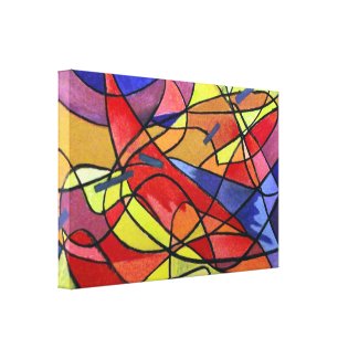
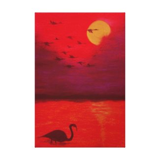
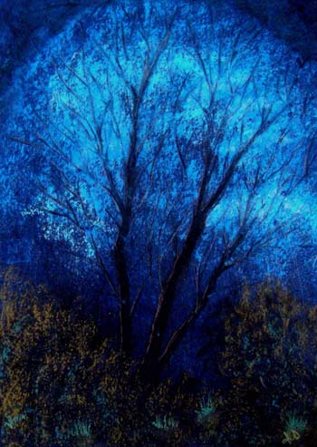
The final stage is shown here again , I had by now added some texturing, more smaller shapes and cross hatching to add detail and interest to the painting. Even if you do not like abstract painting, and I am not a great fan of this "free art" you have to admit it has a little of the style of Kandinsky, with a tiny reference to Miro. And it has very bright colours.

I enjoyed the evening, and have arranged with some of the group for us all to have a go in a couple of weeks. We shall each start with a clean sheet of paper and pass it around the group for everyone to add marks to everyone else's paper. When you get your own paper back, then you we shall all start to create an abstract "masterpiece". I can't wait to see how everyone gets on.

Of course, you can always make your own random marks you do not really need a crowd of people. Hopefully I can let you know how we get on with our abstract exercise.

Saturday 9 March 2013

A flight of Ibis

This one just missed the deadline for the free ebook (see last post) I had been contemplating doing it for some time but hesitating over that bird in the foreground. Gosh it has been so long since I did any real, representational sketching / drawing. Because it is so prominent, I wanted it to at least seem to be seen with good proportions so I filled several sketchbook pages with sillouettes before finally plucking up the courage to attempt the painting.


I am still not really happy with it but at least it has been done and I feel much easier, maybe I will do it again sometime. The biggest problem I have with this is that the birds legs are way too far towards the back, making it seem out of balance. Still I cannot be accused of being a perfectionist so I have already started to add products to my Zazzle stores with this image, will edit it later.


Flight Of Ibis At Sunset
Flight Of Ibis At Sunset by PastelsByArtyfax
You can sell cards , invitations, stamps and more on Zazzle.com!
Flight Of Ibis At Sunset
Flight Of Ibis At Sunset by PastelsByArtyfax
Shop for additional Custom Awards at zazzle.com

Saturday 23 February 2013

How To Learn To Paint Abstracts - Free eBook

First of all, painting abstracts is about painting the feelings that are bought about by a subject, rather than painting the subject. You are not trying to represent the physical appearance of the subject. Therefore, you cannot get it wrong. Only you know how you feel about something, the painting is your way of describing these feelings to your audience.

Many artists however feel awkward about this. They have grown up believing that a painting is "of" something and should look like the original. This must be overcome to paint expressive abstract paintings.
 I would be the first to say that I still have problems with putting thoughts into abstract paintings but I will most stronly claim that by painting abstracts I have improved as a painter immensely. I have a very loose almost semi-abstract style and enjoy painting with colour. You can see what I mean by browsing a few of the earlier posts on this blog. I do find that fellow artists do find some, if not all, of my work pleasing and likeable. Not sure what this means but looseness is something that many artists seek. It works for me, and I find this style so much easier since beginning abstract painting.

When I was asked by my art group to run a workshop on abstract painting, I developed a methodology to enable them to try it out for themselves. I have written about this on Squidoo and you can read and see a step-by-step tutorial here:-


and


I have also collated these articles together into one, free eBook available on Scribd for download.

I will in the near future be completing a "game" utilising sets of cards to give the arrtist some basic starting points to help with creating abstracts . I shall be saying more of this later.

Wednesday 13 February 2013

New Pastel Landscape Painting

I was so pleased with last weeks "Tree and Sky" painting that I found another similar photo to take a shot at. This time a sunset, or maybe a sunrise with loads of colour in the sky and trees sillouetted against the sky.


This has been slightly edited in photoshop to try to achieve the feeling of the original painting.


Do you have problems with photographing your art work. The light can affect the look at your work, as you may have found out and it is almost impossible to edit the piece to get back to the original colours. Vitally important if like me colour is an important aspect of your art. The original photograph had a much more insipid appearance, and I wanted to  nudge it in the direction of the original painting.

I always try to photograph the artwork in daylight and then to edit as little as possible. visit my photography blog, Photography For fun, to see a few examples of what happens or can happen, using this piece as an example.

Wednesday 6 February 2013

Completed "tree and Sky", a pastel painting

I had to do something with it, the painting from last week. I simply wasn't happy with it. Apart from the issues I raised in the last post, the perspective for the clouds looked wrong. Although it was reasonably faithful to the original photo, every artist knows that the lower down in the sky a cloud is, the farther away it is and should be smaller to provide recession. Solution: remove the clouds!

I fixed the painting so that I would not get any mixing of the pastels when I applied further colours, etc and went back in with a lighter blue to remove the clouds. You can see traces of them but that does not worry me. I repainted the tree and its branches and this time added a lighter edge to the main trunks / branches. It was quite a dark brown buut of course against the black it showed up relatively light.

Next step was to emphasise the foliage at the bottom of the painting. I used an olive green (again it looks lighter than it was) and a smaller area of a dark hookers green (ish!) to paint in a textured undergrowth.

I am now very pleased with the result. Zazzle here I come!


It does not show up too well in the photograph (probably taken too early in the morning as I was in a hurry- and may try to get a better photo) but there is a very good 3-D effect between the foliage, the lower trunks and the general background.

This shows better in a photoshopped copy of the image:


Much happier now and I will be putting this onto Zazzle where prints / poster / cards of the image may be obtained; more details later in the week for those (if any?) who might be interested.

Wednesday 30 January 2013

A work in progress - a break with tradition.

I though I had finished this pastel painting and photographed it, loaded to my PC and then sat and looked at it. No it wasn't what I had intended at all.


What is wrong? Well the clouds are not like clouds, they look more like misplaced foliage and in the original photograph there was a vaulted appearance to the sky, I need to darken the top corners of the painting.

If you want to see the original by Robin (waterlily on Redgage), please be my guest; just pop over to the image titled heavenly.

You will see that it is not quite the same effect, I will be working on this again and will repost when I have completed it to my satisfaction. Check back to see when it is complete.

Monday 28 January 2013

Adding figures in a landscape

Once upon a time I used to worry about drawing in a realistic fashion, I used to worry that people would look at them and say, "That isn't right!". In my early artistic career, I started to learn to paint and draw people. Portraits and figures. But I soon learned that the masters of the 20th century had had little truck with that notion, and finding the process boring I became less worried about getting figures absolutely right in my landscapes. So I practiced drawing with fewer marks (Turner drew the dog in the Haywain with five strokes apparently). Here are a couple of drawings from those days:


A sketch of my son with seaweed from a photograph

This one was from a photo but I was going to life classes at one time

practising for "victorian" landsapes


Eventually, I became less bothered even than this
figures became mere shapes in the overall composition


Now I rarely use figures at all.
 

with certain exceptions

Do I miss them, no I don't think so. My approach is to create what I think of as semi-abstract images based on colour rather than strict form. I enjoy this far more than when I was struggling with those figures.

Wednesday 16 January 2013

Storm and Light

Just jumping in with this new painting, I was at the art group last night looking for inspiration and came across a painting of a storm which I liked and gave me an idea; I also found a picture of a lighthouse. I tried this one which incorporates a little of each of these images with my usual style of using the pastels to create texture.

I am not very happy with the result especially the way I have drawn/painted the waves. these were out of my head and I really needed to have found some sort of reference before attempting to paint them. But as usual, I am not afraid to post my failures as well as my successes. THere are some aspects of this I do like but mostly, I think I can forget it. Not one to put on Zazzle or Redbubble for instance.

Well here it is, any thoughts you care to share?


Looking at it now, I can't think what made me put the hint of yellow on the horizon, maybe some idea of the approaching end of the storm? I really should stick to a reference to paint things I am not too familiar with. I guess I do like the colours and several of my recent works have included sillouettes so I must be working up to something.

Last night I was so disappointed that I decided to start working with the small canvasses again next week. Coping and changing helps keep my interest up but doesn't help with development, since I find that I need to relearn certain basics. One step forward and two steps back so to speak. C'est la vie!

Monday 14 January 2013

Tips on painting figures and portraits

Christmas has been quite a barren time for new art from me so instead I have been doing a little reading and thinking about old work. Here are a couple of old sketches from life classes I used to attend.
We all have to start somewhere, one of my first portraits


getting better


 Now we are talking


Coloured, done in soft pastel


In fact, one of the reasons I looked these early sketches/drawings out was that I found an article with four tips for drawing people. I though they were very useful and could help tremendously. They were:-
  1. Vary the lines you are using, thick and thin, single and multiple
  2. Move your hand and the paper, the movement in your wrist is important
  3. You are not connecting the dots, do not overdo the outlines
  4. Vary the cross hatching, and don't use perfect right angles
Find the tips and read more on Artist Daily and whilst there check out the free e-book on figure painting.