Showing posts with label pastel. Show all posts

Wednesday, 5 March 2014

Pastel Painting, A Ray Of Sunshine

BAck to landsscapes this week. I happened to see a piece that I found grabbed me. The cnmposition, and that patch of sunlit just clicked with me. Of course, As ever I have not copied the original but created my own interpretation. The colours especially are my own, although the composition owes a lot to the original. But even the old masters repeated the same images to learn.

A Ray Of Sunshine


I was very pleased with this one, I usually am when I have a strong urge to paint something. Its those times I have to search for inspiration that I turn out the duff pieces.

I thought I would add a couple of images of the work as it progressed, to give an insight into my process.


This was after I had added the "first" colours for the background. As I do, I had built up to this point by layering colours (each layer fixed to avoid disturbing the former) to get that wonderful texture that I love from my pastels. This did not quite feel right though. I had the sunlit grass at thte top of the rise but was not happy with the sky.


Here I had added a darker blue to the top of the sheet and blended it into the very light blue sky to create that recession.

The next step was to put this aside and take out a sketch pad. I selected my colours for the bushes, etc and practiced what I was going to do. Using the side of some very soft pastels I then came back to the background (which had been lightly fixed) and painted in the bushes, as I had done in the sketch book. The last step was to take a few conte sticks and add the linear effects to the foreground.

I work dark to light mostly although some later details may be in dark tones. And I work from hard pastel to soft, again fixing layers as I proceed. The final details are not fixed to maintain their vibrancy.

Tuesday, 25 February 2014

Abstract Holiday

from time to time my paintings start to become "samey" and I begin to lose my way, creatively speaking. Things stop working for me and I lose interest. It is on these occasions that I allow myself an "abstract holiday".

I can paint what I like, no need to worry about producing a great masterpiece and  it really helps me to find my way again.


This is tonight's result. I did not start with any preconceptions except that I was going to make this a work in two halves, with a large red area on one side, the smaller side of the paper. It is in pastel and is painted on a very rough 200 lb water colour paper; size about 16 x 12 inch.

Of course everyone thought it was an image of buildings but I did not have this in mind at all when in the process of  painting. It was purely geometrical considerations which were uppermost in my mind.

Of course, the magic of digital editing means that once I have the image in digital form, I can play around with the colours to my hearts content. In fact the original has been "re-coloured" so that the larger blue area has been made bluer to hide the purple/violet which I found I did not like. I normally do a series of thumbnail sketches to see if a colour combination works before I start on the actual painting. Unfortunately I did not do this with this painting.

Just to show the effect of different colours and degree of saturation, I include two edited images.


All three are better than the ooriginal unfortunately, c'est la vie!

Wednesday, 12 February 2014

A colourful sky, a pastel painting

Painting has been taking a back seat recently as I have been very busy and also decided to start my very first novel. But I still manage to get to my art group, once a week for a couple of hours so it is great that I can usually complete one of my landscapes in that time.


This one for instance, one which I really like and received some very good comments from my colleagues at the art group.

But painting it was more involved than it might appear.

Starting with an A4 sheet of black general purpose art paper (cheap!), I covered the paper with a layer of black pastel. Simple linear strokes with the side of a softish pastel stick (origin unknown). This was then blended all over using circular strokes with the tips of three fingers and then fixed using an inexpensive hair spray.

I repeated this procedure twice using a mid-blue pastel and then a dark violet pastel. This was the background.

The next step was to use a mid-brown, again on its side, to paint in the top of the horizon at the bottom of the painting. below this a dark green was wiped across the painting. These colours were blended where they overlapped, and then grass-like strokes were added at the extreme bottom in a lighter green and other colours.

Cloud shapes were the next step. A light and mid-violet were used to create the main shapes and then a red to top off these shapes. A mid-blue was then added to create texture around the clouds.

Next, a red-brown was used -on its side- to create the colouring on the horizon. This was blended in a single direction (up) using the side of the thumb to create the spiky appearance. More colours were added at the horizon to ground this colour. I am not sure what it represents, make your own mind up but it does help the composition.

And finally, some dark brown was added and blended along the lighter brown of the horizon.

Here is a shot of the original from a book :-


it is in Ron Ranson's Painting School Series, PASTELS by Diana Constance.

Mine is not meant to be a reproduction of the original, I always aim to create a  painting from a reference which inspired me without copying. 

Perhaps this is more involved than you thought after all.

Tuesday, 10 December 2013

Two Pastel Paintings, Mace Reeds and The River

I have completed two pastel painting this week, both were paintings which I was not sure of and left them to mature before adding final touches.

The first was from a photograph which had been posted by a friend who graciously gave permission for me to use as a reference for the piece. It is basically a photo of a mace reed bed and I was attracted to it because of the multitude of colours which became obvious as you looked at the photo. Very simple on the surface but became less so as you looked hard at it. Here is the painting:-


The range of greens and yellows/browns is actually impressive. The top border consists of reflections of dead and dying foliage at the edge of the pool. In fact I have tried to put some movement into the reeds by snaking the leaves rather than leaving them stiff and straight.

The second pastel is in fact taken from a watercolour painting I did when holidaying at a small village (three houses and a pub) called Cwym Cych, in North Wales close to Abersoch. The pastel is very high key (for me) and reflects the watercolour. The origjnal was a wet-into-wet piece with very few hard lines, so I was unsure whether it would translate into pastel, but here it is:-


If you look carefully at the piece you may see horizontal lines through the top of the LHS trees and across the sky. It appears that the paper was faulty as I have rubbed out the lines and when adding back the pastel the llines have reappeared. These things are sent to try us.

Thursday, 24 October 2013

Painting a pastel landscape from a watercolour

I have been a little lazy recently in terms of my painting, and looking over some old watercolours decided to try one or two of them in pastel. Should be easy! However watercolour has features very different from pastel in many respects and the feeling of a watercolour could be difficult to achieve.

So I set myself this little challenge. Take a watercolour and repeat it in pastel to create a painting with the same feel.

This was the first painting I would try:-


This had always been a favourite of mine and I felt that for the puposes of this challenge it would be ideal. The earth colours gave it a very definite autumnal feel. Also, the light background spoke of mists and early morning.

The image I actually used as a reference for the pastel was actually cropped, I don't kbnow why, to remove some of the area from each side. But never mind, here is the pastel:-


Not quite as much detail, especially in the foreground, but nevertheless I am quite pleased with the outcome of this experiment. I am of a mind to do it again using the full sized original and concentrate more on the foreground but I will try one or two others before I do that.

I feel that the feeling of the original watercolour has been captured, success!


Tuesday, 15 October 2013

New Pastel Landscape Painting

I have been so busy lately that I have found it difficult to find time to paint. Fresh back from holiday in the Canary islands, I attended my art group tonight and came away with another painting, hope that you like it.


My colleagues saw this and though it had been painted using a dark/black paper. However, it is done on a white ground. I do create a background using dark colours before I start painting. I do this by layering several colours which I choose based on the effect I hope to achieve.

This painting was started with a covering of purple pastel, this was loosely rubbed in and fixed to avoid mixing with subsequent layers. the next layer was a dark blue. A less intense covering this time, but again rubbed in using the tips of my fingers and well fixed. A final background layer od black was then layed down.

Someone said, "why not use black paper?". The answer is that I find black paper too flat, I prefer the dark colour obtained by building up two or three layers.

In this case the black layer was not fixed and I painted the foliage into a soft black layer. There was some mixing but I kept it to a minimum and constantly wiped the pastel sticks used for the foliage to avoid any over mixing.

The final steps were to draw in the grey tree trunks, and add a shadow to the nearer trees; and then to add some linear marks to represent reeds, etc, by the bank of the water.

Reflections were added very simply by drawing down with the same colours used on the top part of the painting.

Wednesday, 7 August 2013

Red Sky at Night, a pastel painting

My latest creation was completed last night at my regular art group meeting, I have to admit is was from an idea in an art magazine advert. I usually make far more changes to my work when I use another piece as a reference but most old masters have copied works by other old masters since time immemorial, and in a spirit of learning, I have painted my own version of this image.

The colours were the main atttraction for me, but the variation in the tints and shades within the large flat areas was something that is new to me. I know all about variation as a principle of composition but I mostly use texture to provide it. Here it is a use of a those differing colours that I have trie to understand and copy.

Here is a version of the painting as a work in progress:-


It is very nearly completed but lacks details. Also, I took the photo late at night in a room lit by ordinary light and did not use flash, so the colours are "wrong". A problem with not using the right light, photographers and artists will be familiar with this problem.

The completed work is show below:-


Having taken a photo in better light, the colours are much truer to the original, but still long way out. I am going to havae to take another in bright daylight before I start posting to places like Zazzle. I will also post the newer image here for comparison.
Note the additional details including the beansticks (support for climbing vegetables found in many UK gardens). More contrast in the sky and trees.

Watch out for the improved photograph soon.


Saturday, 9 March 2013

A flight of Ibis

This one just missed the deadline for the free ebook (see last post) I had been contemplating doing it for some time but hesitating over that bird in the foreground. Gosh it has been so long since I did any real, representational sketching / drawing. Because it is so prominent, I wanted it to at least seem to be seen with good proportions so I filled several sketchbook pages with sillouettes before finally plucking up the courage to attempt the painting.


I am still not really happy with it but at least it has been done and I feel much easier, maybe I will do it again sometime. The biggest problem I have with this is that the birds legs are way too far towards the back, making it seem out of balance. Still I cannot be accused of being a perfectionist so I have already started to add products to my Zazzle stores with this image, will edit it later.


Flight Of Ibis At Sunset
Flight Of Ibis At Sunset by PastelsByArtyfax
You can sell cards , invitations, stamps and more on Zazzle.com!
Flight Of Ibis At Sunset
Flight Of Ibis At Sunset by PastelsByArtyfax
Shop for additional Custom Awards at zazzle.com

Wednesday, 13 February 2013

New Pastel Landscape Painting

I was so pleased with last weeks "Tree and Sky" painting that I found another similar photo to take a shot at. This time a sunset, or maybe a sunrise with loads of colour in the sky and trees sillouetted against the sky.


This has been slightly edited in photoshop to try to achieve the feeling of the original painting.


Do you have problems with photographing your art work. The light can affect the look at your work, as you may have found out and it is almost impossible to edit the piece to get back to the original colours. Vitally important if like me colour is an important aspect of your art. The original photograph had a much more insipid appearance, and I wanted to  nudge it in the direction of the original painting.

I always try to photograph the artwork in daylight and then to edit as little as possible. visit my photography blog, Photography For fun, to see a few examples of what happens or can happen, using this piece as an example.

Wednesday, 30 January 2013

A work in progress - a break with tradition.

I though I had finished this pastel painting and photographed it, loaded to my PC and then sat and looked at it. No it wasn't what I had intended at all.


What is wrong? Well the clouds are not like clouds, they look more like misplaced foliage and in the original photograph there was a vaulted appearance to the sky, I need to darken the top corners of the painting.

If you want to see the original by Robin (waterlily on Redgage), please be my guest; just pop over to the image titled heavenly.

You will see that it is not quite the same effect, I will be working on this again and will repost when I have completed it to my satisfaction. Check back to see when it is complete.

Thursday, 28 June 2012

Spanish Sunset - Pastel Painting

OK, I have painted another pastel, this time not a tree in sight.

It is taken from a book called 30 minute PASTELS. I love the loose style which the author adopts to complete a painting in this short time. Exactly the way I like to paint. I have actually done this once before but the result was not quite as I wanted it. I was at a loose end this week and flipping through one or two books and magazines and came across this particular image. I knew straight away that i had to have another shot at it.

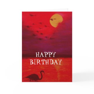
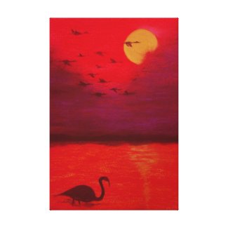
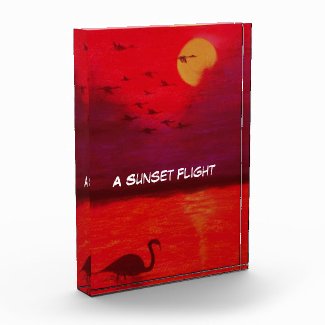
The beauty of this one is the use of the side of the pastel stick to create incredible textures. And of course the redness of it! Makes a fantastically emotive landscape, I feel. The drawing is not as good as it should be but using thick pastel sticks it is difficult to work with any detail.

Anyway here it is for your perusal, I would love to know what you think about it.


The way I approach this sort of painting is to first of all create a background in a suitable colour using the sides of the pastel sticks. I would normally use more than one colour, creating a complementary under-painting which I fix with (shock horror) cheap hair spray. This has two functions:-

  • It prevents the "empty canvas" syndrome and subsequent procrastination.
  • It provides a marvellous tooth for subsequent layers of pastel.
In this case I had already got a background in my satchel, I had prepared a few earlier without any consideration of what the final paintings may look like. The background in question was simply the perfect colour for this piece.


You will notice that it is not made to be uniform, it could have been far more varied but for this subject as I said it seemed perfect.

I then carefully selected a few pastels; yellows, reds and oranges and stroked the paper with the side of the sticks to create the variation of colour in the sky and the water. Light and loose strokes provide the required texture, which can be seen in the following details.


It is important to use a light touch and to skim the surface. This leaves the background showing through, so it is important to use a background with the right colours. I did say above that I often use a complementary colour (to the top layer) which gives a really sparkling effect. Here though, The colours are from an analogous (hot) colour scheme.


To complete the painting, one or two details; the sun and its reflections are included with a subtle approach - not too much to stand out uneccesarily. The far shore / mountains are created in a very similar way using a dark brown and a soft black.

Finally the two boats are then drawn in a soft black pastel. As I said, the drawing could have been better and if I do it again (as if I would!) I will use a thin stick of soft charcoal so that I can put a little more detail in here. Not too much just a little more detail.


It always feels good to get out of a rut and this painting has certainly pleased me both in its creation and its final appearance. (offers accepted. LOL)


Wednesday, 6 June 2012

Painting To Find My Feet Again

Having suffered a bereavement in the family, it has been difficult to maintain interest in art, but going to a weekly art group has been a great help. I have been toying with pastel paintings ( they don't need much setting up - just paper and a few chalks) and although nothing very exciting had been forthcoming from my efforts, the past couple of weeks, I seem to have produced a couple of half decent painting. I thought that they would be worth posting here.
The first was something I dredged up from my own mind, I had started a background to try out some black sketching paper which I had been bought for christmas. Various family illnesses had stopeed me experimenting before then and I found it was not really suited to pastel, at least not for my style - I thought. However, I did not throw the background away, and looking for something to do last week I decided to carry on with it.

Now my approach with pastels is to cover the ground (paper in this case) with one, two or even three colours so as to provide an interesting base to paint on. This is an example:-


I then use an inexpensive hairspray (I am incorrigible!) to fix this layer for two reasons
  1. I can overpaint without colours mixing or smudging
  2. The grittyness of the fixed pastel layer provides a great "tooth" for subsequent painting
Although the black paper did not appear to work well at first, with the added (fixed) layer it became quite amenable to being used by overpainting. I stayed hard at work for about two hours with a short break for coffee and this was the final result.


Now I was very happy with this, and have received some very good feedback. I had at last done something I could feel proud of which wasn't totally abstract. Not that I have anything against abstract art of course, but I felt much better at this. Very atmospheric, I was told by one of my crritics.

Last night, with this in mind, I decided to try and finish a painting with a similar theme which I had started some time ago. Again, I felt pleased with the final result, although not quite so pleased as with the one shown above.


I hope that I have come through what has been a very difficult time, and will be back to enjoying my painting and other artistic endeavours. They say time heals, well time and art may well be helping to do just that. Coming back from a very low point, I am beginning to feel quite positive and optimistic.