Saturday, 29 October 2011

Learning to paint abstract art

I have for a long time been interested in abstract art and for most of this time have simply been painting very loosely in what may be called a (semi)-realistic-abstract style. Yes, I know a bit of a mouthful and a contadiction in terms , but I never know what to call my paintings. I am now trying to start to paint a series of paintings which do not rely on an imaginary subject - just to see if I can do it. Will it provide me with a satisfactory result, willI be happy to exhibit these paintings in my next exhibition ( with the art group).

I have done this before, that is exhibiting abstracts but although I felt good about them I was very defensive about the paintings for a reason that I could not quite fathom. I guess I hear too much of the, "my two year old could do better than that", crap. Many artists would love to be able to paint with the freedom of a two year old, but that does not necessarily mean the result is a great or even a good painting. Maybe too much "illiterate" art has been put before the public in the name of "freedom of expression".

First of all, I do have a certain amount of drawing skill, maybe not the best but these sketches below show results from life classes which I used to take every week.


I have to admit that I became bored with this sort of art, for some reason I was not attracted by the subject, so I took to landscapes:


This suited me much better, and I have been happy to paint landscape paintings for getting on for 25 years but again I am feeling that there is more. My landscapes have become looser and I have begun to use the descriptive term semi-abstract, but there has always been an element of the subject matter remaining.


Some years ago I did some abstracts for my group's exhibtion, just to be different but as I said above I felt quite defensive about the results although I had spent a long time working out what I was going to do, sketching the ideas and finally committing the work to canvas. This is a short video I mad putting together some photos from that exhibition.


Finally I have decided to bite the bullet and to try and develop my skill with pure abstract painting, so that I can feel confident about the art and proud of putting it into an exhibtion.


I would love to hear what you think of these last two paintings, they are both done in pastel and are approximately A4 in size ( 8.5 x 11.5 inch). You may comment here or on a larger version of the art shown on RedGage:- for the yellow abstract and for the blue abstract.

Thanks in advance and I do hope to be able to post more abstract work in the very near future.

Note: RedGage is a website that pays you for your content and monetizes your social activity. Why not start using it today.

Saturday, 3 September 2011

A new use for an old sketch on Zazzle

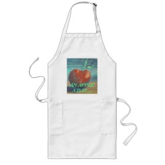
Do you keep old paintings and sketches? Apart from those that I have sold, I have always stored away all my paintings and sometimes pull them out and reminisce about the good old days. (good old days because I used to paint much more oten, and although often simple they had a quaint charm). But I have started to find uses for some of these older works, on Zazzle. I have started a Zazzle store and a covering blog, and am looking for interesting images - not just "good" paintings but ones I hope will trigger a purchase. Of course these are the difficult ones to find and wether I am right or not will be answered over the next few months, I guess. One of the newer additions is this apron, with an image of a sketch from one of my first forays into oil paints. A very simple sketch but one I have always liked for several reasons. Will this plus the text ( my attempt at dry humour!!!) set off that trigger. PLease feel free to browse on over to the store and see what I am making of it, in fact I am starting multiple stores to try and develop niche markets, rather than having large department (?) stores. You might also find Artyfaxcards interesting, and they are quite inexpensive for individually designed products, LOL

Saturday, 27 August 2011

Pastel paintings - landscapes

I have been using my pastels at my weekly art group meetings for the past couple of weeks and of course they havae all been landscapes. One of the issues that I have painting at these group meetings is that I always feel I need to complete a painting on the evening. I don't get much time for art at home these days and keeping a painting from one week to the next doesn'r really appeal to me. The first was done very quickly, This was the Tuesday of the riots (in the UK) and we spent a loy of time putting the world to rights before beginning to paint. I did not have much time left and so chose a very quick subject.

From a rerference photo of a barn in the Trossachs ( Scotland). I think it is the colours here that is attractive about this one. Simple and hence quick but quite effective I believe.
This was done on a yellow ( A4 size) paper, which is why the clouds have a slightly green tinge. The paper colour obviously works well for the colours in the rest of the painting.

The second took most of the 1.5 hours that we have on the evening ( plus a half-hour coffee break) and although I was a little unsure of this at first, I now find it very pleasing.

An italian scene, a little licence taken with the reference but I was trying to use a new technique, or at least different from my usual method of working with pastels. Note the many small strokes to get an optical mix ( a la Pointilism) rather than broad strokes with the side of the pastels. This is again approximately A4 size and is on buff card. The many small strokes produce an all-over layering which hides the colour of the ground. I shall be trying this technique out againg soon.

This last piece was anotherfairly quick piece but due to the subject more than the disturbances of friendly chatter. Again the strokes are very broad from the side of the pastel pieces.
Also A4 sized card, actually the back of a writing pad. I find that the surface of this source allows me to work with many layers because I fix each layer as I work throught the painting, a detailed look at my technique is seen in an earlier post basically here a light shade of orange was layered on the ground and a yellow and a red were layered onto this after fixing. The initial layer is thus allowed to be seen through the overpainting. Various earth colours were used for the foreground and for the trees.

As usual larger images can be seen on my Flickr account if you want to try to see how the stroke work affects the textures of the paintings.

I was asked about my pastels on Flickr, and I quote this from my answer on that platform..... "I use artists soft pastels. I have a very large collection of different makes / types and colours. A large part of the collection is of professional quality but I do have lots of artists coloured chalks.
The favourites in my collection are Daler-Rowney or unison ( very soft without being too crumbly) and Caran d'Ache (harder for line work) but I have by no means tried all the many makes available. In between these I have aquired many different sets and odd colours as presents and from browsing in art shops, etc.
I do have oil pastels but rarely use these, possibly because mine are of poor quality, i.e. too waxy and hard"


Sunday, 14 August 2011

New pastel painting, Barn in the Trossachs

MAnaged to get this in last week at my art group, we spent lots of time talking about the recent riots and I couldn't settle down. I hadn't prepared a reference subject so picked something finally which I thought I would finish in the 45 minutes or so which I had left.

I was struck by the colours in this piece and decided as usual to add my own interpretation. Not my usual style as I did not build up the one in layers but just kept painting until I was happy with the result. Lots of texture as usual rather than detail drawing. The size is approx A4.


Oh yes.. it was actually done on a yellow paper which is why the sky thru the clouds seems a littlte greenish - can't get everything right all the time, LOL


Wednesday, 27 July 2011

Quick pastel sketches

This week at my art group evening, I couldn't make up my mind what to do.............. procrastination is a killer!! So what was I to do? I really don't paint as much as I ought to and I shopuldn't be wasteing my time there trying to make up my mind. So I stuck in a hypothetical pin and chose two subjects from a handy magazine. I had my pastel box with me so thought I would just do a couple of quick 20 minute sketches and pick one of those for a "proper" painting next week.

This was the result:-


This took my fancy because of the limited range of colours. Basically an analagous colour scheme, if you are not sure check out this page by myself on How To Use The Colour Wheel. The subject was also quite simple, although I admit I  took this to extremes here. A very peaceful scene.


Again this is quite simplistic, but lots of detail for the time allowed. After the last one I kept the colour choices to a restricted palette except for one or two passages to contrast with the blues. The high peak on the right seems a lot darker than it should. It causes the eye to wander to the edge of the painting - not a good compositional choice. However I was rushing to complete in the 20 minutes.

I think that the first of these will be my subject for next week, quite like the vignetting and may incorporate this into the work.


will let you see it when I have finished it, bye for now.

Saturday, 23 July 2011

An approach to painting with artists pastels - layering colours

After the last post, I thought at my art group this week I would prepare an easy demo of the way that I approach my pastel paintings.

I often use several layers, using fixative between each layer. The free use of a fixative is often deprecated in many books and tutorials but I find that by building up a textured layer effect, I can get paintings which I am very pleased with. Of course high-lights, particularly in white should be left for the last layer, which I do not fix as in this case fixing will have a deleterious effect on the colours. However I find that darker colours are not affected and fixing each layer helps to build up a wonderful "tooth" so that subsequent layers do not become "muddy".

I decided to do another very simple beach scene, sky with clouds and sand. There is a suggestion of something at the horizon but no etailed imagery. This demo is about the painterly effects not about drawing.

I started by covering the rough cardboard media with complementary colours where the sky and the beach were to be.


This was quickly followed ( after the fixative had dried) by slashes of colour applied with the side of the pastel stick. I have also rubbed the pastel into the surface using my finger tips.I do not want the colour of the card showing thru at all.

You can see the first layer thru the new layer. Interestingly, I had used this board for drawing practice before I started to do this demo and had wiped off the pastel with a cloth; the remains of the image show thru the applied pastel - see central uper sky area. You can also see that I have left a little gap at the horizon. I sometimes run the colours together depending on the subject, the amount of overlap depends on the effect to be achieved.


Not quite satisfied with the cover at the last stage, I have applied more of the blues and yellows. In fact I used three shades of each colour. It is fairly easy to pick out the shades of blue because of the recession that I am looking for in the sky.


I have now put some clouds in with white and used a reddish shade of brown ( actual colour unknown- I have a large collection of pastels and I now I should remember the colours but I pick out of the box something close to what I want). I have also gone over the whole painting with another layer, again using the sides of the sticks but very lightly. I am now catching the previously applied pastel which gives what I think is a wonderful texture and which is something I always strive for in my pastel landscapes. The purple at the horizon is also beginning to be built to look as if something might just be there.

I was unhappy with the sky at the last stage, the darkest and lightest shades of blue were too obvious, so I have mixed a little of each in this image and sacrificed some of the texture by rubbing them together with my finger tips. I have also applied a little white into the yellow, but maintained the textures here.

A little more texture and a few clouds below the main bank in the distance. I am now happy with this as a painting and will leave it alone, to be viewed later.


Although this is an extremely simple landscape, I find that it does offer something, and this is the texture which I can achieve using this layering technique with fixing between each stage. I started to do this when I first used pastels for abstract work and think of it as something I have developed but would be ready to be proved wrong if you know different.

Saturday, 16 July 2011

A simple beach scene in pastel and the effect of minor details.

Following the last post, I took out my pastels again. It had been quite a while since I had used them and I was looking for an idea for simple composition to get my hand in again. I seem to switch between watercolours and pastels regularly with a dabble with acrylics now and again. Nice to keep myself on my toes, but I always seem to need to play around with each media for a little before I try a major painting. re-learning the hand / brush movements because each is so very different to any of the others. Pastels and acrylics allow overpainting whereas watercolour of course is not so forgiving. I always make use of this ability to lay a background colour, often a complementary hue before painting the true colour for an object.

For example, I will colour any grass area red/orange before layering over this with a green/yellow hue. My prefered method of using pastels is to prepare the painting with the complementary colours and then to fix them. I tend to use cheap hairspray for this, it works well and it smells nice. I will then use the pastel on its side to wipe on the second and third colours. I find that this allows the development of a very useful texture. I first found out about this technique when creating abstracts but I now use it for virtually all my pastel paintings.


You can see this effect most clearly in the sky in this WIP image, although it is also used in the foreground and in the hills behind the building. The unfinished appearance of the painting is striking when compared to the completed work although only a few minor details are added.


I have slightly darkened the purple hills and the texture is now almost hidden, but have added shadows to the left of the nearer hills to give a little detail and bring them forward a little. A few minor additions to the buildings and their connection to the ground upon which they stand help to identify and ground them. Further layering of colours to the foreground adds texture to bring it forward. And most importantly, the boat is modelled with shadow. The last addition was the grasses/reeds in the lower left corner to add a touch of balance, without overpowering the very simple composition. Just shows what the addition of a few details can do for a painting, however never go too far. Know when to stop. It is easy to add more but difficult to take it away again.

I have to say that I do in fact like this and will probably frame it. I have already had one or two appreciative comments, which makes it all worthwhile from members of my art group and from contacts on Flickr where you can see a larger image of the finished work.

I will try to post a better explanation of the technique I use in another post, take a few more pictures which show the progress of the painting, as the pastel is applied. I have not seen this written about anywhere else and would be grateful if you have seen a tutorial to perhaps let me know. At the moment, I keep saying that it is a technique I have developed but am open to being shown otherwise.